Why the Print Felt Wrong Even Though the Colour Was Right
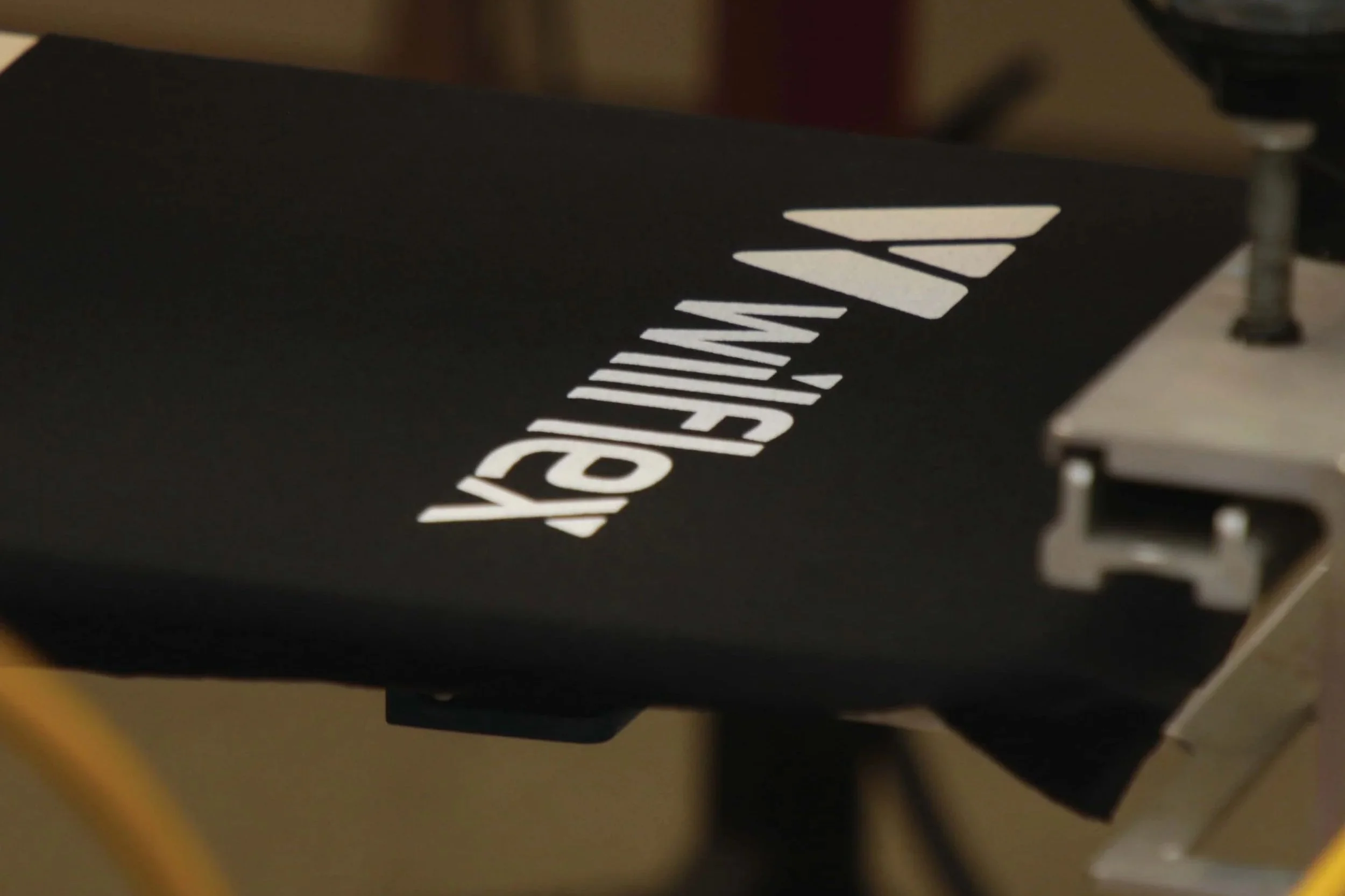
A fashion label's order comes back from a customer with a complaint that's hard to action: it doesn't look wrong, it feels wrong. The colour is a perfect match. The shirt just doesn't feel like the brand's usual soft, premium merch — it feels stiff.
Nobody mis-mixed anything. The ink chemistry itself was the decision that mattered, and it was made without anyone realising it was a decision at all.
Why It Happens
Plastisol sits on top of the fabric. It's durable, opaque, and forgiving on press — which is exactly why it's often the default choice, including for jobs where it isn't actually the best fit. Sitting on top of the fabric is also what gives it a firmer hand than an ink that dyes into the fibre instead.

Plastisol is valued for its strong opacity, durability and reliable performance across textile printing applications. Because the ink sits on the surface of the fabric, the finished print can have a more substantial hand feel than inks that penetrate into the fibres.
What It Costs
This is a fault that passes every visual check and still gets rejected. It's expensive precisely because it looks fine — the reprint isn't triggered by an obvious defect, it's triggered by a customer's hand on the fabric, which is harder to catch on a production floor doing visual QC than a colour or registration fault would be.
For a fashion brand specifically, hand feel is often part of the actual product experience customers associate with the label — getting it wrong doesn't just cost a reprint, it risks the brand's perceived quality on future orders too.
The Technical Detail
Water-based ink dyes into the fabric for a genuinely softer finish, at the cost of needing more process control than plastisol — drying and curing behave differently, and it performs best on cotton and other natural fibres rather than synthetics. If the brief calls for a premium, soft-touch result, that has to be decided at the ink stage, not adjusted afterwards on press.
Industry ink suppliers such as Wilflex/Avient publish technical data sheets comparing hand feel, opacity and cure requirements across their plastisol and water-based ranges — worth reviewing against the specific brief before defaulting to whichever ink is already loaded on press.
What This Means for Your Next Job
Ask about hand feel before ink is chosen, not after a sample is printed. "What should this feel like on skin" is a different question from "what colour does this need to be," and it has a different answer depending on the ink system — plastisol, water-based, or a DTF transfer film — long before the job reaches the press.
Hand feel should be considered before the ink system is chosen. The amount of ink deposited on the fabric and how it sits on the surface can significantly affect how the finished garment feels, making print feel an important part of the production brief.
Want the Full Breakdown?
The complete guide lays out plastisol, water-based, solvent and UV-curable inks side by side, including exactly where hand feel, durability and cure fit into the decision.
Frequently Asked Questions
Can plastisol be made to feel softer?
To an extent, using softer formulations or thinner deposits, but it will still sit on the fabric surface rather than dyeing into it — there's a ceiling on how soft plastisol can feel compared to water-based ink on the same fabric.
Is water-based ink always the "better" choice for soft hand feel?
Not universally — it needs more process control, performs best on natural fibres, and isn't always the right call for durability-first jobs like workwear. It's the better choice specifically when soft hand feel on cotton is the actual brief.